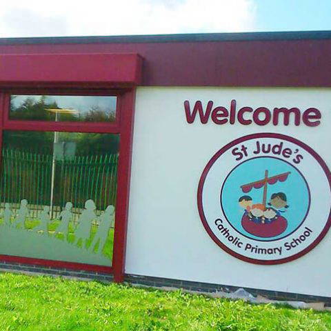
St Jude’s Catholic Primary approached us to help them create some sensational new branding for their school. We began by using one of our lesson plans which the teachers at St Jude’s applied to guide their pupils through the process of creating a logo. We would then take the best of the school children’s ideas as the basis for a new logo and then roll that out into the sensational new branding that St Jude’s were eagerly awaiting.
The lesson plan was a great success and the school was really pleased with the results the children had created. We took the chosen idea and developed it further and created a great new logo for the school. By using our lesson plan St Jude’s not only had a new, modern logo that really reflected who they were but they also had a logo that was quite personal to them. With the logo in place we then began creating banners and leaflets for the school to use to advertise their successes and inform prospective parents/carers about facilities they could offer such as St Jude’s pre-school. We also began work on some new signage for the school. Window graphics that were translucent shapes of children playing and enjoying being active were designed to go in the large classroom windows near the school entrance. This helped to visually bridge the outside and the inside of the school bringing them together as one environment. Using cut lettering we placed the words ‘welcome to’ near the main entrance of the school and beneath that a large outside wall display which was the school’s new logo. The use of the logo on such a scale was great, it created an immediate impact and told a story about the school in one simple visual outside wall display.
St Jude’s now have an identity and an environment that speaks to visitors and the school family about St Jude’s and its place in the local community.
More like this…
Transforming Langley Schools’s school signage and wall displays
Discover how Design for Education helped Langley Academy revamp their school’s external signage and internal wall displays to convey a message of Equality, Diversity, and Inclusion (EDI). Explore the unique project that emphasised EDI, and the stunning designs that refreshed the school’s visual identity, with the finished work being greatly admired by all of their teachers and students.
New curriculum wall art gives a great feeling at Hart Academy
New curriculum wall art gives a great feeling at Hart Academy as pupils experience a whole new environment. Our wall art and directional signage has created a new learning experience for the school. From atoms to anatomy, mountains to momentus historical events, with...
External school signs at Westborough high school
The first thing any visitor to your school will see is your external school signs. It costs no more to manufacture and install a well-designed sign than it does a badly designed sign so there really is no reason not to have well-designed school sign. To ensure...
School signs and wall displays at Horbury Academy
One of the key objectives of the school rebranding was for it to be a platform to relaunch the school. The headteacher wanted the students to return to school, after the summer holidays, noticing a dramatic difference. These impressive school signs did just that... We...
External signs for Nook lane Junior School
External signs for Nook lane Junior SchoolYour external signs are the first thing visitors, children, staff and parents see when they arrive at your school. If it looks tired, drab and uninspiring then that is probably what people first impression will be....
School Signage at Nevill Road
The school signage was the most effective ways to showcase the new brand to children, parents and visitors to the schools. One of the key objectives of the rebrand was to show a united front across both the Infant and Junior school and consistently presented signage...

