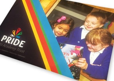
Pride was a relatively new MAT, they already had a logo but needed this expanding into an overall brand identity.
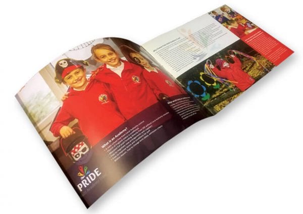
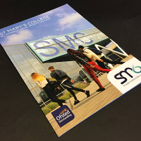
The starting point for developing the MAT branding was to produce a brochure.
The brochure was to be an initial introduction for schools who were interested in joining the MAT. Using the existing logo we developed some initial design concepts for the brochure. These were developed into a final design which then led the MAT’s branding.
If your MAT is looking for a new brand identity or a refresh of your existing brand have a look at our school branding page.
Looking for more inspiration? have a look at our case studies section which features all our most recent projects. If you would like to discuss your project with us please don’t hesitate to get in touch.
More like this…
Complete school rebrand to reflect a new vision and values at Fairfield School
Based in Batley, West Yorkshire, Fairfield School is a special school catering to the complex needs of students aged from four to nineteen. We were approached by the school business manager Steve Walsh, as they were looking to undertake a rebranding project to reflect their new vision and values. You can see the finished results of their new school branding here.
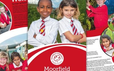
Moorfield Community Primary School Prospectus goes digital
Moorfield Community Primary wanted a primary school prospectus that would fully engage with readers. From large photographs filled with the personality of the children and the school to a prospectus that embodied their branding. Moorfield Community Primary chose an...
Primary school logo design and branding at Maney Hill Primary
Primary school logo and branding at Maney Hill PrimaryWe were happy to help when the school contacted us to help them with their primary school logo design and branding at Maney Hill Primary. The old logo had become tired and they wanted a new brand and logo which...
Medical Prospectus for St Mary’s College
St Mary's in Hull is a secondary, Sixth Form and College. We was asked to design a prospectus which can following the branding through to all three sites. We started off by doing a photo shoot at all three sites the produced concepts for the prospectus from a very...
Stylish new prospectus for Mirfield College
The design of the Mirfield College prospectus had a very different brief to the one we had for the main school. This brochure needed to appeal to the students as they were the key decision makers. The pictures we got from the photoshoot were great and we decided to...
Birchwood Community High School and College Rebrand
Brilliant branding at Birchwood Community High School Birchwood's new branding was divided up into 3 key stages. Concept design stage During this stage we developed a brief from the new Headteacher who wanted to rebrand the look of the school starting with their logo...

