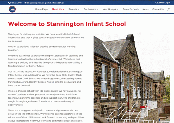
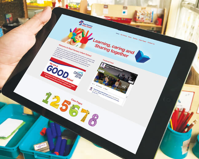
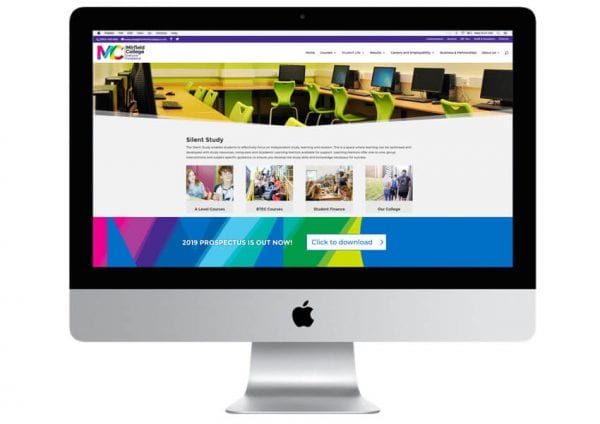
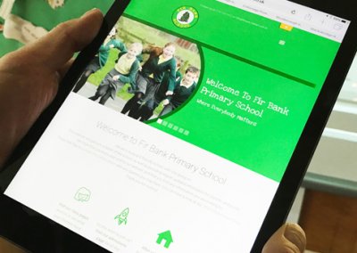
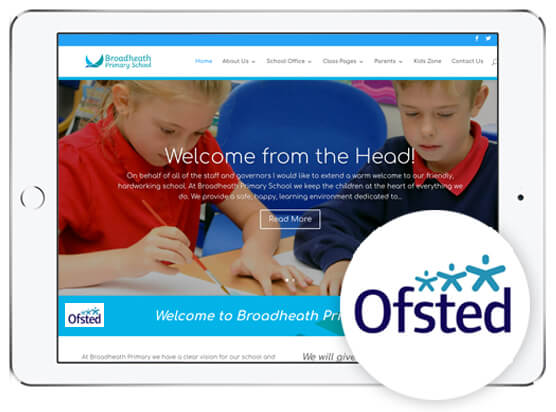
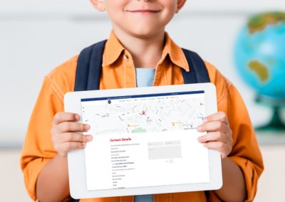
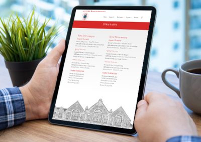
Your school’s website is a virtual front door to your school. It’s often the first point of contact that prospective families have with you, and plays a crucial role in shaping vital first impressions (as Stannington Infant School understood when it wanted a new school website design). Yet designing effective school websites isn’t simply to attract new students; it’s a valuable resource for current students, parents, and staff.
Your school’s website design is so important that Ofsted rules dictate what you must publish on it; but this alone will not ensure that it is effective. Which is why we’ve written this article – a comprehensive guide to designing an engaging and user-friendly website for your school. In it, we explore crucial school website design elements such as navigation, accessibility, aesthetics, and content management, to ensure your school website project meets the highest standards of effectiveness and usability.
Understanding the Audience – Who Will Use Your School Website?
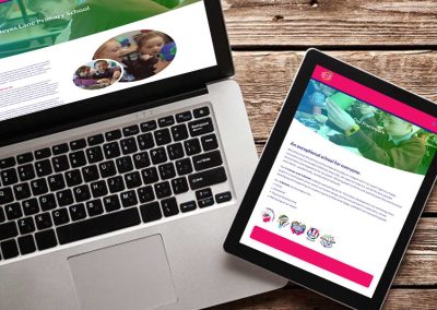
The first step to design an effective school website from scratch (as we did for Heyes Lane Primary School), is to understand who your website’s primary users will be. Typically, these include students, parents, teachers, and prospective families. However, each group has diverse needs and expectations, and you’ll need to consider these when designing and managing your website content:
- Students: Looking for resources, schedules, and news updates.
- Parents: Seeking information on school policies, events, and their children’s progress.
- Stakeholders: For example, Ofsted, the Department for Education, and the Local Authority that may wish to find statutory information
- Prospective Families: Evaluating the school for potential enrolment, looking for information on curriculum, facilities, and admissions processes.
By tailoring the design and content to meet these diverse needs, you’ll ensure that you deliver a user-friendly website that serves your entire school community.
Now, let’s move on to the essential elements of school website design: intuitive navigation; accessibility; aesthetics; and website content management.
Why Is Intuitive Navigation Crucial?
Navigation is the backbone of any user-friendly website, determining how easy it is to find information when it is needed. Intuitive navigation means having a clear, easy-to-use menu structure that guides users without confusion.
Best Practices for Navigation:
· Simplified Menu Structure
Ensure that the menu is easy to understand by using straightforward categories and subcategories.
· Consistent Layout
For example, keep the navigation bar in the same location on every page.
· Mobile Functionality
Many people now access websites via their mobile devices, and it’s crucial to deliver user-friendly experience for all. As an example, advanced scrolling functionality is a must to ensure that users can navigate websites on mobile phones with ease.
To gain a better understanding of what intuitive navigation on an effective school website looks like, review the navigation bars of top-performing school websites. You’ll notice that many use clearly labelled tabs and dropdown menus, guiding users from main categories to sub-categories.
What Is Website Accessibility, and How Can You Ensure It?
Web accessibility means making your website usable for everyone, including people with disabilities. Ensuring accessibility is not only a legal requirement, but also an ethical responsibility. To achieve this, you should adhere to several key guidelines.
First, following the Web Content Accessibility Guidelines (WCAG) is essential. These provide a comprehensive framework for making web content more accessible to people with disabilities. Adhering to WCAG helps meet international accessibility standards, ensuring that your school website is usable by a broader audience.
Another critical aspect of accessibility is the use of alt text (alternative text) for images. This is a descriptive text that is added to images on a website, helping visually impaired users in understanding the content of the images and ensuring that they can fully engage with and benefit from all visual content on the site.
Lastly, it is important to ensure that all functions of the website can be accessed via keyboard shortcuts. This is vital for users who may have difficulty using a mouse or other pointing device.
Incorporating these guidelines into the design and development of your school’s website can make it a more inclusive resource for all members of the school community.
(Tip: Use tools like WAVE and Axe to evaluate your website’s accessibility and make necessary improvements.)
What Role Does Aesthetics Play?
One of the first things that users will notice is how your school website looks. It’s crucial not to underestimate the impact that visual design has on user experience and engagement.
You should select a colour scheme that reflects your school’s identity and school branding, and that is visually appealing. This will ensure that your website remains consistent with all your branding products, as well as creating an inviting and professional atmosphere for users.
The fonts you use should be easy to read and consistent throughout the site to maintain a cohesive and polished look. Consistency in typography helps create a seamless user experience, making the website more accessible and engaging.
Don’t overlook the need to incorporate high-quality images that help to describe your school’s values and culture, as well as being visually appealing. Images used should reflect the school’s environment, achievements, and community, thus telling your story in a visually compelling way.
Finally, ensuring consistency in design elements such as colours, fonts, and images across all pages is vital to reinforce your brand and portray a professional and welcoming doorway to your school.
Why Is Content Management Crucial?
Your school never stands still, and neither should your website. Providing regularly updated and relevant content is vital for keeping your website engaging and informative – an imperative we achieved when we designed and built a new school website for Heyes Lane Primary School. They wanted their staff to be able to post school-related updates (like information on non-uniform days and sports events) easily and quickly.
Here are three tips to help you achieve this goal:
- Use a CMS (Content Management System) like WordPress or Joomla to streamline content updates.
- Schedule updates to ensure you neither miss updating your school news providing information on events, nor neglect other essential information.
- Publish engaging content that keeps your audience informed and coming back for more. Examples include school news, event calendars, student achievements, term-time calendars, and galleries of school images to keep the content fresh and engaging.
What Must Be Included for Ofsted Compliance?
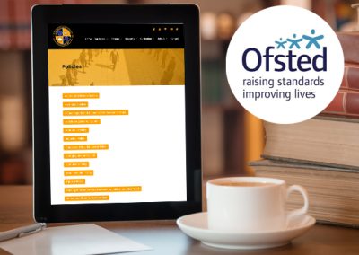
Ofsted stipulates that there is some information that must be included on school websites, and it is one of the first things that the regulator will check before visiting your school. You’ll need to comply with Ofsted requirements to ensure compliance with various legislation, including the School Information (England) Regulations 2008, as amended by the School Information (England) (Amendment) Regulations 2012 and 2016, the Equality Act 2010, and the Children and Families Act 2014.
Required information includes:
- Statutory Policies – all required policies such as safeguarding, SEN, and admissions.
- Performance Data – including exam results and Ofsted reports.
- Contact Information – including an email address and phone number.
Information that Ofsted recommends you publish on your website includes:
- Curriculum Details – outlining the curriculum for each key stage.
- Extracurricular Activities – highlighting sports, clubs, and other activities available to students.
Additional Features to Enhance User Experience
Having covered the basics, let’s now look at features that will help take your school website to the next level. These include what we call responsive design, interactive elements, and multimedia.
Why Is Responsive Design Important?
Responsive design ensures that users enjoy the same user experience whatever their mode of access, be it desktop, laptop, tablet, or mobile phone.
One of the key practices is fluid grid layouts. These flexible grid layouts adapt seamlessly to different screen sizes, ensuring that the website maintains its structure and readability however it is accessed.
You’ll also need to ensure that images scale correctly across various devices, adjusting size and resolution automatically to maintain visual quality without compromising user experience.
Lastly, it’s critical that mobile-friendly navigation is used to make sure that you provide an intuitive and easy-to-use menu that allows users to find what they need quickly, even on smaller screens. This might include the use of collapsible menus, hamburger icons, and other touch-friendly navigation elements to enhance usability on mobile devices.
How Can Interactive Elements Benefit Users?
Just as young children enjoy pop-up books, and older children (and many adults) enjoy video games, interactive features can significantly enhance user engagement and satisfaction. Designing your school website project to include interactive elements like the following will help your website, and school, stand out and keep users engaged:
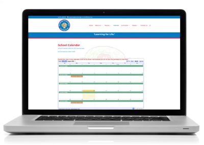
- Calendars – provide interactive calendars for events and important dates.
- Forms – include online forms for enquiries, admissions, and feedback.
- Forums – create forums or discussion boards for parent-teacher communication and student collaboration.
You shouldn’t neglect social media, either. 83% of the UK’s population have at least one social media account, and this isn’t simply a great way to share information; it’s also a leading strategy to drive traffic to your school’s website. This is why we recommend that you include social media feeds on your website to make it easy for parents and others ton stay connected and informed.
How Do You Integrate Multimedia Effectively?
Multimedia elements like videos can make your website more dynamic and engaging, but they can also negatively impact performance if not managed correctly. To avoid this, you should optimise performance by compressing images and videos to improve load times. Another best practice is to add captions and alt text to images to give them context and improve accessibility.
Tips for Continuous Improvement of Your School Website
Once you have designed, built, and published your school website, this is not the end of the story. Content must still be added, consistency must be maintained, and performance must be managed and improved. User feedback and website analytics provide valuable insights into how your site is performing and where improvements can be made.
By incorporating user feedback and website analytics (using tools like Google Analytics to monitor traffic, user behaviour, and other metrics) in your website management practices, you’ll be able to make data-driven decisions to enhance user experience and functionality.
Designing the Ultimate School Website: Where Do You Start?
Designing an effective school website involves careful consideration of navigation, accessibility, aesthetics, and content management. By focusing on these elements and continuously improving based on feedback and analytics, your school can create an engaging and user-friendly website that serves your community well.
Now is the perfect time to evaluate your school’s website. Are you providing the best possible experience for your users? Does it portray your school as a shining beacon in its community?
If you need expert assistance, get in touch with Design for Education for professional school website design services that meet your unique needs. Together, we’ll create a website that truly reflects the excellence of your school.
More like this…
6 Strategies to Boost Your School Website Compliance
6 Strategies to Boost Your School Website ComplianceIs your school website compliant? It’s a question that all maintained schools must address, and completing a website content checklist isn’t enough. When Ofsted inspects, it wants to see that you have done more than...

