A well-crafted school prospectus is crucial in today’s competitive world of education. Your prospectus will be the first glimpse of your school that many prospective pupils and their parents receive. Whether a primary school prospectus or secondary school prospectus, its content sets the scene for what they can expect.
Thus, enhancing your school prospectus with visual elements that include wall art photography, infographics, branding, and custom illustrations is no longer a design choice or ‘nice-to-have’ – it’s a strategic move that can significantly boost your school’s appeal.
In this article, we explore ways to enhance your school prospectus, covering key visual elements and design strategies that can transform your prospectus to reflect who your school really is – and make your school stand out from the crowd.
Whether you are updating your secondary school prospectus or creating a primary school prospectus from scratch, these tips can serve as a school prospectus template, and help you craft a compelling document that resonates with your audience.
What Role Do Visual Elements Play in a School Prospectus?
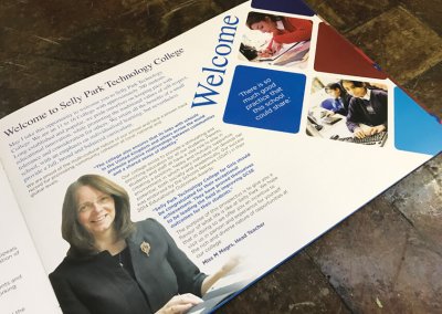
First impressions count, particularly when it comes to your school’s prospectus. The visual appeal of your prospectus is crucial. It helps to immediately convey your schools’ ethos, values, and educational environment. Like it or not, we all make snap judgements – and your prospectus must make a positive visual impact as soon as it is picked up and opened.
This is why visual elements such as wall art photography, infographics, and custom illustrations are such powerful tools. The right visuals can evoke emotions, tell stories, and make information more digestible – and importantly, deliver a stronger, long-lasting, positive impression.
What Types of Visual Elements Should Be Included?
There are several key visual elements that can elevate your school prospectus:
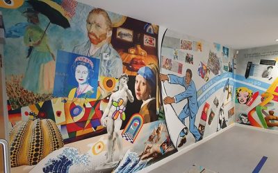
- Wall Art Photography: Photographs that capture the essence of your school environment, showcasing its facilities, student life, and unique atmosphere.
- Infographics: Visual representations of key data and information, such as academic performance, extracurricular offerings, and student demographics.
- Branding: Consistent use of your school’s logo, colours, and typography throughout the prospectus to reinforce brand identity.
- Custom Illustrations: Bespoke illustrations that add a personal, creative touch to your prospectus, setting it apart from generic designs.
How Can Wall Art Photography Capture Your School’s Identity?
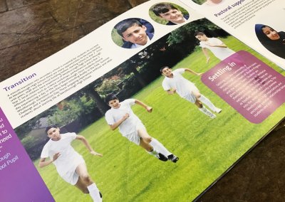
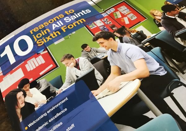
Selecting the right images is key to capturing and communicating your school’s identity. You need to include images that highlight your school’s energy and spirit, as well as the physical environment: photos that show students engaged in learning, taking part in extra-curricular activities, or simply having fun with their friends.
You should consider key elements of framing when photographing your school environment: consider angles, lighting, and composition. Your goal should be to make the reader feel like they are walking through the school, and to set the scene for the atmosphere they themselves or their child will experience here.
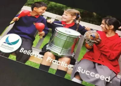
For maximum impact, be strategic about placement of images in your prospectus. Start with a visually compelling image on the cover to set the tone as you would with the home page on your school website. Consider how each image you select will integrate with the text throughout your prospectus to maintain interest in a cohesive and visually pleasing design.
How Can Infographics Simplify Complex Information?
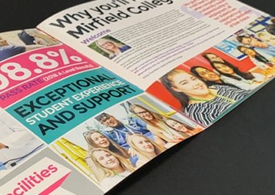
Another example of how to use visuals effectively is to incorporate infographics that present complex information in an easily digestible format. For example, if your secondary school prospectus includes data on academic results or the variety of extracurricular activities offered, infographics can help present this information clearly and concisely. This way, prospective students and parents will more easily understand key information.
When designing infographics, it’s important to choose colours, fonts, and icons that reflect your school branding. Keep the design simple, but ensure that it stands out without being overwhelming. Finding the right balance of information while focusing on clarity and readability is key.
How Can You Incorporate Branding Creatively?
Consistent branding will help to reinforce your school’s identity, values, and mission. Your prospectus should be instantly associated with your school – use your logos, colours, typography, etc. throughout.
There are many ways to creatively incorporate your school’s branding into the prospectus. For example, use your school colours in the headers, footers, and key highlights within the text. The school logo should be prominently displayed, not just on the cover but throughout the document. Even subtle touches, such as using branded icons or custom illustrations in your school colours, can strengthen brand identity and create a cohesive look.
Why Do Custom Illustrations Add a Personal Touch?
Adding custom illustrations to your prospectus can make it more memorable and distinguishable from others. Bespoke illustrations can be personalised to reflect your school’s unique values, mission, and personality. They can depict anything from the school’s mascot to abstract representations of the school’s ethos.
If you plan to create illustrations in-house, ensure they align with the overall design and branding of the prospectus. If using a professional, external illustrator, ensure they understand your school’s brand and vision (apply the principles of creating an effective wall art brief for your school).
An extra tip here is to use illustrations that reflect the school’s values or history. These can be particularly effective, adding both visual interest and narrative depth to your school’s prospectus.
What Are the Best Design and Layout Practices for a School Prospectus?
A well-designed layout is essential for an effective school prospectus. Let the principles of layout design (balance, alignment, and hierarchy) guide the structure of your school prospectus template. This will help you produce a cohesive layout that enhances readability and ensures a logical and engaging flow of information.
Examples of effective layouts include using a grid system to organise content, or creating sections that are clearly delineated by headers, sub headers, and visual breaks.
What Pitfalls Should Be Avoided?
While visuals are important, it’s crucial not to overload the prospectus. Too many images or overly complex infographics can distract from the core message and overwhelm the reader. Accessibility should also be a priority; consider the needs of all readers by ensuring sufficient colour contrast, legible font and font sizes, and clear, concise content.
Another mistake to avoid is to only publish in a physical format. We live in a digital world and, as Moorfield Community Primary School realised, maximum reach is dependent upon delivering your prospectus in the format that prospective parents and pupils want to read it.
Enhancing Your School Prospectus – The Bottom Line
In today’s competitive educational landscape, a school prospectus that uses visual elements effectively can be a powerful tool for attracting new students and their families. By focusing on the key design elements of photography, infographics, branding, and custom illustrations, your school can create a prospectus that not only informs, but also inspires and engages its audience.
Investing in a well-designed prospectus is an investment in your school’s future. Whether you’re creating a new secondary school prospectus or refreshing a primary school prospectus, the right approach to visual design can make all the difference. For a professional consultation to help you deliver a knock-out school prospectus, contact Design for Education today
More like this…
How to Create an Inspirational School Environment with Wall Art
Explore how Design for Education partnered with Sheffield Springs Academy to transform their secondary school environment with captivating wall art. This creative transformation celebrates Sheffield’s uniqueness and embraces diversity, providing an immersive and inspiring learning atmosphere for students. See how our creative design can revolutionise an educational space.
School Wall Displays to Communicate Vision and Values at Costello School
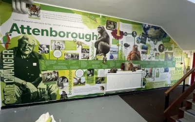
Design for Education collaborated with Costello School to create vibrant wall displays that effectively communicate the school’s vision and values to students and visitors. Each mural, inspired by influential figures like David Attenborough and Rosa Parks, was meticulously designed to reflect the school’s ethos and inspire students. The project not only transformed the school’s environment visually but also reinforced its commitment to nurturing future leaders and thinkers.
Sheffield Springs Academy, our latest creative wall art project
Explore how Design for Education partnered with Sheffield Springs Academy to transform their secondary school environment with captivating wall art. This creative transformation celebrates Sheffield’s uniqueness and embraces diversity, providing an immersive and inspiring learning atmosphere for students. See how our creative design can revolutionise an educational space.
Transforming Langley Schools’s school signage and wall displays
Discover how Design for Education helped Langley Academy revamp their school’s external signage and internal wall displays to convey a message of Equality, Diversity, and Inclusion (EDI). Explore the unique project that emphasised EDI, and the stunning designs that refreshed the school’s visual identity, with the finished work being greatly admired by all of their teachers and students.
Birkdale School, wall art project for the common room
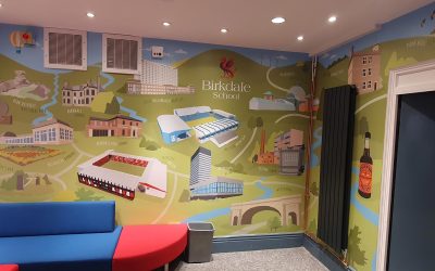
In our recent project at Birkdale School, we revitalised their common and locker rooms in the School’s basement, infusing them with wall art that celebrates the heritage and landmarks of Sheffield. This transformation not only brightened the space but also provided an inspiring atmosphere for students. Our team delivers bespoke designs that enrich educational environments and enhance learning.
Science Mural Ideas to Ignite Students’ Curiosity and Learning
You can transform your school walls with science murals that both captivate and educate. From timelines to narratives of inspirational scientists, these murals make learning an immersive experience. Use visual storytelling to inspire curiosity and reinforce your curriculum concepts effortlessly.
